How To Create Wireframes In Sketch
How many wireframes have you done? I have made thousands of them during my professional career. This was a need of tools and processes. However, through time, I optimized the workflow. I changed my methods and tools. Now, I will show you why wireframes are not needed anymore to succeed with design.
I talked many times why wireframes are redundant now. In this article, I update and extend thoughts from Wireframes – The Fifth Wheel of UX Design Process.
So, if you want to stop making wireframes – grab the mug of your favorite coffee and continue reading!
What are Wireframes?
Wireframes are images which display the essential functional elements of a web, desktop or mobile app. They are typically used for planning a site's structure and functionality. Usually, they are created without color or rich iconography. They are raw grayscale versions of mockups.
The main goal of a wireframe is to visualize the concept of digital design quickly. Thanks to this, stakeholders and the team may review those ideas and approve them. Wireframes may be used for initial user testing. They are created before the designer will jump to the detailed high fidelity mockups that were usually time-consuming.
These deliverables theoretically ensure that the information architecture will be structured correctly. This is why it is also important to include real text resources, not just placeholders like "Lorem ipsum…"
Wireframes are usually created in tools like Axure, Justinmind Prototyper, or Balsamic.
The navigation scheme and flow may also be visualized with wireframes. Low fidelity prototypes are often built from these deliverables. This way, designers can quickly validate some aspects of the planned solution.
However, nowadays mentioned characteristics and goals of wireframes are no longer valid. In the further part of the article, I will explain why.
Advantages of Wireframing
Let's briefly remind the benefits of creating wireframes:
- Good in concept visualization – this was why wireframes were created. The requirements and ideas may be quickly visualized thanks to them.
- Quite fast – Designer creating wireframe does not think about colors, typography, or images. Building from grey blocks and boxes ensures rapid creation. However, making wireframe takes much more time than a simple sketch made with pen & paper.
- Quick idea validation – finished wireframe visualize the scheme of the desired feature. It may be presented to the team and discussed or even put into the user testing.
Key reasons why I do not use wireframes anymore are in their disadvantages:
Disadvantages of Wireframing
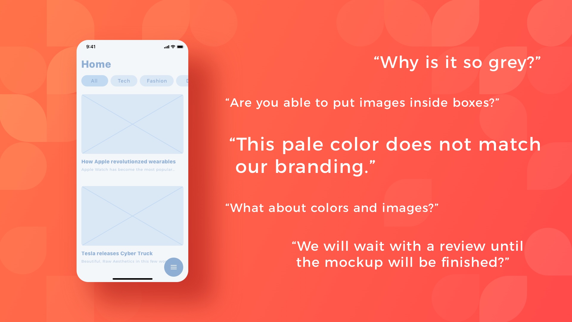
- Clients/Stakeholders do not understand wireframes – Many times, I was a witness of the situation when the non-technical person asked why the mockups are so grey and include ugly icons. Sure, we need to educate clients, but it is not natural for them to look at digital grey boxes. On the other hand, sketches are much more understandable and efficient. Sketching is natural for people, and everyone can participate in that.
- Not so fast – In the old times when UX/UI Designers had to use Adobe Photoshop for UI Design, wireframes were real saving because their creating seemed to be extremely Fast. But, now we have got Sketch, Figma, XD, and InVision Studio – each of these tools boosts our workflow in a way Photoshop never could. They are incredibly efficient to use when you create high fidelity mockups. What is more, if you use UI Design System Library to start a project, you will produce high fidelity mockups faster than wireframe!
- Time waste – even if you have to make changes to high fidelity mockup, it will be reused. A wireframe is a redundant element that has to be updated if you include it in your documentation, even if there are changes only to the final design. It is a next deliverable that does not bring much more value than a quick sketch, and it is less usable than high fidelity mockup.
- No creativity – putting together grey boxes do not give a chance to unleash the full potential of your creativity. This may lead to the situation when your final high fidelity design looks just like the painted wireframe.

The Design Process Without Wireframing
In my opinion, working without wireframes is a real pleasure. What's more, mockups library for documentation is much easier for maintenance. Let me show you a piece of sample workflow that I use successfully without wireframing:
1. Analysis
The moment when you listen to the stakeholder, discover requirements and empathize with users by doing initial research. During this phase, make notes. It would be great if you can make them on paper because this way, your brain will be more active and creative.
2. Brainstorming
The moment of design thinking process when you collaborate with others in making a solution to the needs of users and businesses. Make quick paper sketches, present them to others, and discuss.
3. Sketch more detailed ideas
After the collaborative part of the design process, you may want to sit alone and sketch the final results. Sketching will reveal pain points and suggest enhanced solutions.
4. Get feedback
If the client is present in various stages of a project, final sketches are perfect deliverables to discuss and get feedback before doing high fidelity work.
5. Jump from sketch to Sketch (or another digital tool)
In the old fashioned workflow, this could be the moment for wireframes. But now, you have modern digital tools. Adjust your UI Design library template to match client brand and start creating high-fidelity mockups.
What is more, usually, a single mockup does not show the potential of the feature. You should think about making a simple prototype, or visualize the application structure with User Flows. Personally, I love these deliverables, and making User Flows directly in Sketch is very convenient. User Flows gives you a single picture of a process or full app structure on one image. It can be quickly analyzed by the team and is usually well understandable.
What Instead of Wireframes?
The main goal of not making wireframes is efficiency. Here are things you should do instead of these gray boxes:
- UI Sketching – you got faster results with almost the same value as wireframes. You can use printable templates to speed up the process with practical constraints.
- High fidelity mockups – jumping right into high fidelity mockups after sketching is possible thanks to modern design tools. To skip all boring stuff related to the setup of colors, typography, and essential UI components, I prepared UI Library – that helps me kick off all projects.
Benefits of Working Without Wireframes
- Unleashing more creativity with sketching – there are lots of publications showing that sketching, drawing and writing on paper unleashes our potential. Our brain is more active, focused, and creative. This should lead to better results.
- Better Client/stakeholder understanding of idea – sketching or high fidelity mockups are well understood by not technical people. Everyone can do a simple sketch, and this is why they perceive them naturally. High fidelity mockup gives a real preview of the final solution – if you present it on a device it will be used (for example mobile) – you should get even better results
- Making high fidelity mockups earlier – creating UI in Sketch is very efficient. If you combine it with good UI Design Library, you will be able to work much faster.
Summing Up
I believe that the modern, efficient design workflow is the one without wireframes. They are a song of the past when digital tools were not yet powerful enough. Now this deliverable is redundant.
Do you still believe in making wireframes? Please leave a comment and let me know why!
By the way…
If you plan to start a new project soon or to organize your UI Library — do not waste your time creating everything from scratch. Feel free to use the Prime — Design System Kit. It helps you design UI with the best Sketch techniques — Smart Layout, Symbol Overrides and more.
See Prime in action.
To make it easier there is a gift 🎁 Use UXMISFIT10 offer code to get 10% Off.
 You can also Create User Flows faster in Sketch — With SQUID you can create User Flows directly in Sketch the sketch file with your artboards. Everything may be done within a couple of clicks. See how it works.
Thanks for reading!
How To Create Wireframes In Sketch
Source: https://uxmisfit.com/2019/12/11/stop-making-wireframes-first-sketch-then-sketch/
Posted by: coxduccies.blogspot.com

0 Response to "How To Create Wireframes In Sketch"
Post a Comment